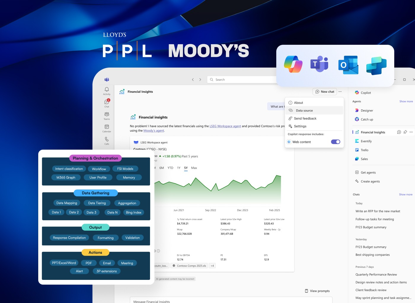
SYSTEMS
⭐ Before we start
Get access to Figma file here: Data Grids
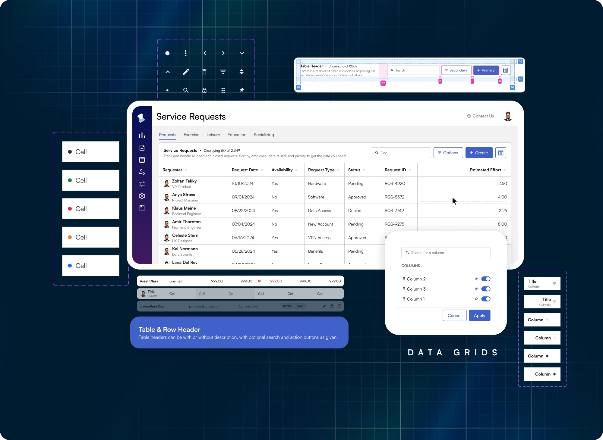
Overview
The Data Grid is one of the most complex functionalities of BEAT Design System. It provides much of the same functionality users have come to expect from spreadsheets, including cell editing, filtering and column sorting. Due to our applications serving financial operations and functions, data grids somehow become an integral part of our apps thereby being the go-to way of organising any kind of data.
Problem Statement: Different tables for different applications… How can we bring them together?
As a solution group BEAT focusses agility over implementation quality at present, which has caused a lot of replications of efforts especially around tables. Older design system has table components however use-cases except read only were barely touched upon in those.
That leads to a lot of inconsistency.
Rationale: 2 in 3 pages always contain data tables within BEAT Apps, a low hanging fruit when it comes to standardization.
Why the columns were re-standardized again?
Even if cells are standardised but tables still look extremely different, as if they're from different applications
Data types generally require ad-hoc use-cases addressing which break tables
No standardised for keyboard interaction and bulk actions
Business Interest: Can it augment user's excel learnings?
The users are habituated with excel tables that work without mouse, mostly with touchpad and working alongside excel. That implies most of the work still happens the way it is, our apps are a place of consolidation of this data. Can we make this switching/data-transfer a bit more convenient for the user?
Cell types currently at play
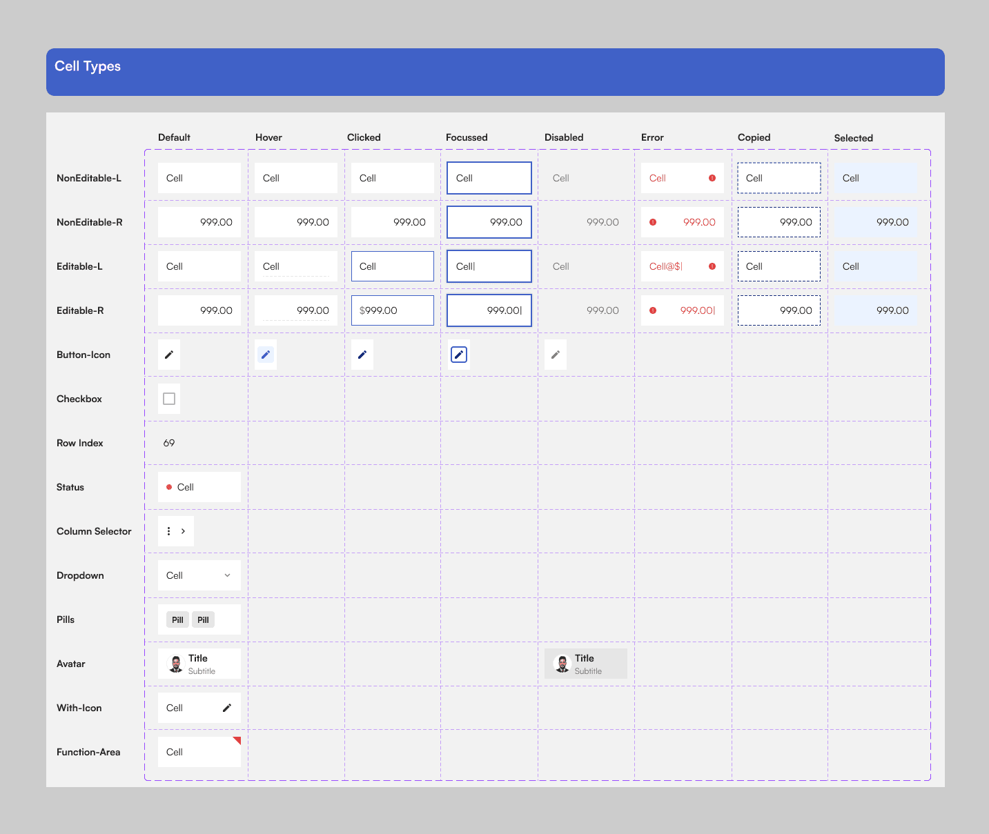
Data Grid v1.0
The product portfolio sees mostly two types of grids across the board which are either are for data consumption or data management. Here's why these two types were identified.
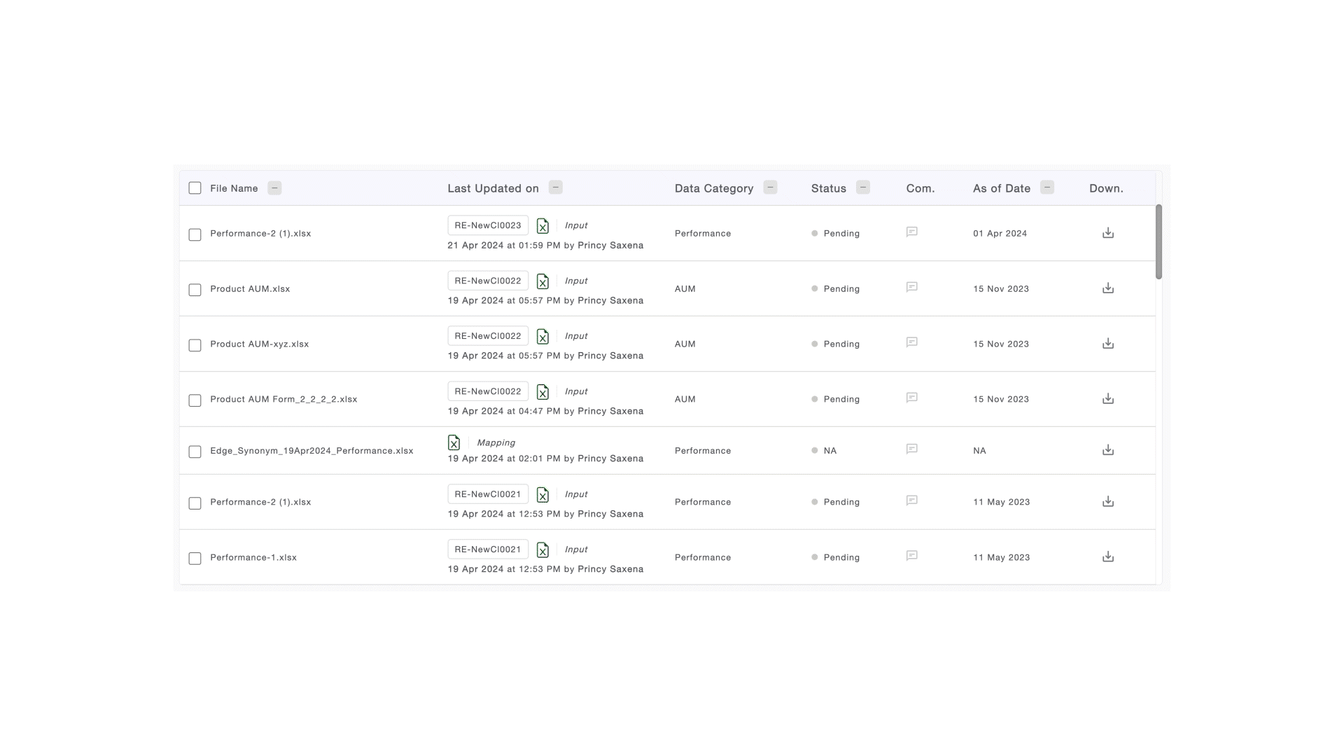
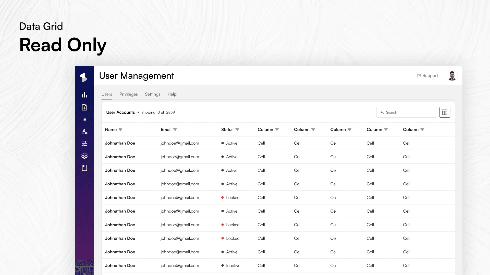
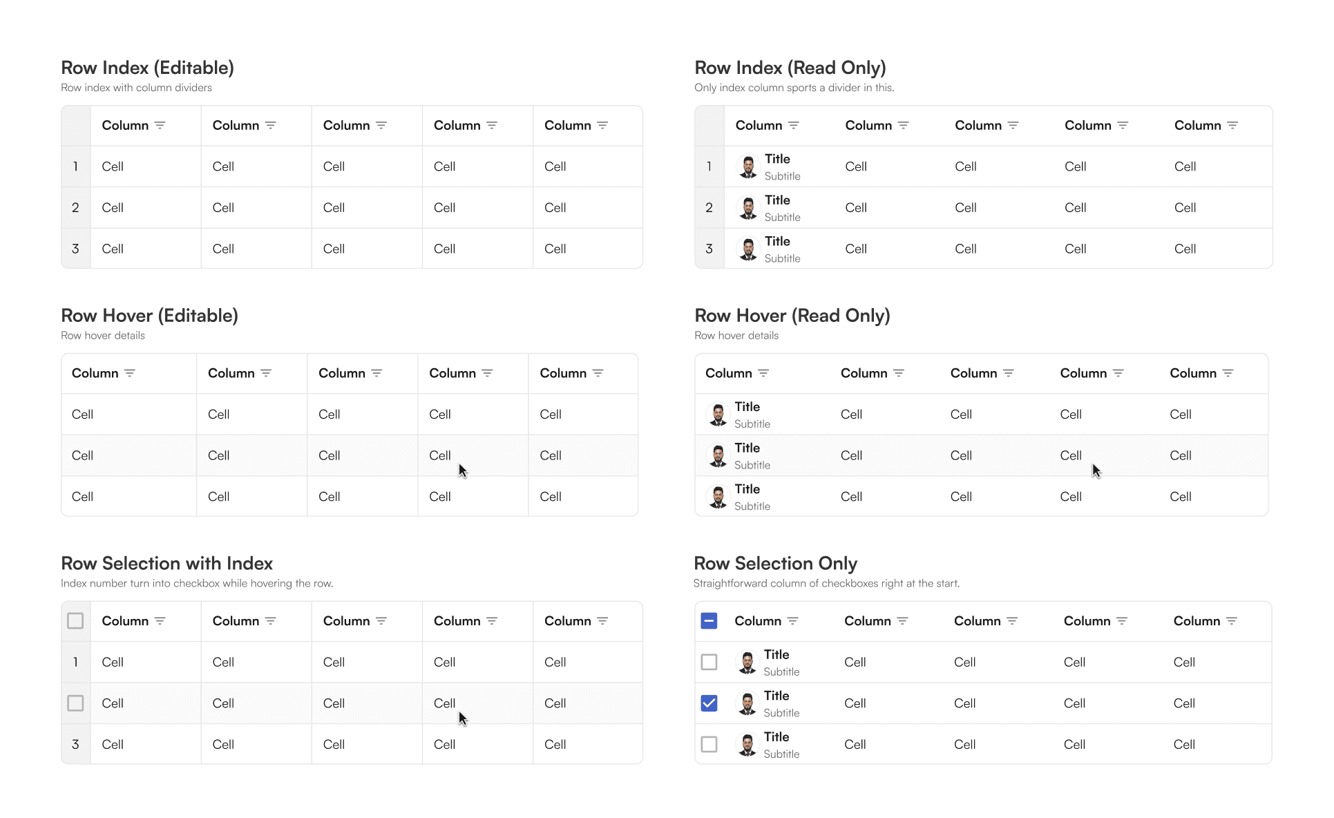
Read-Only
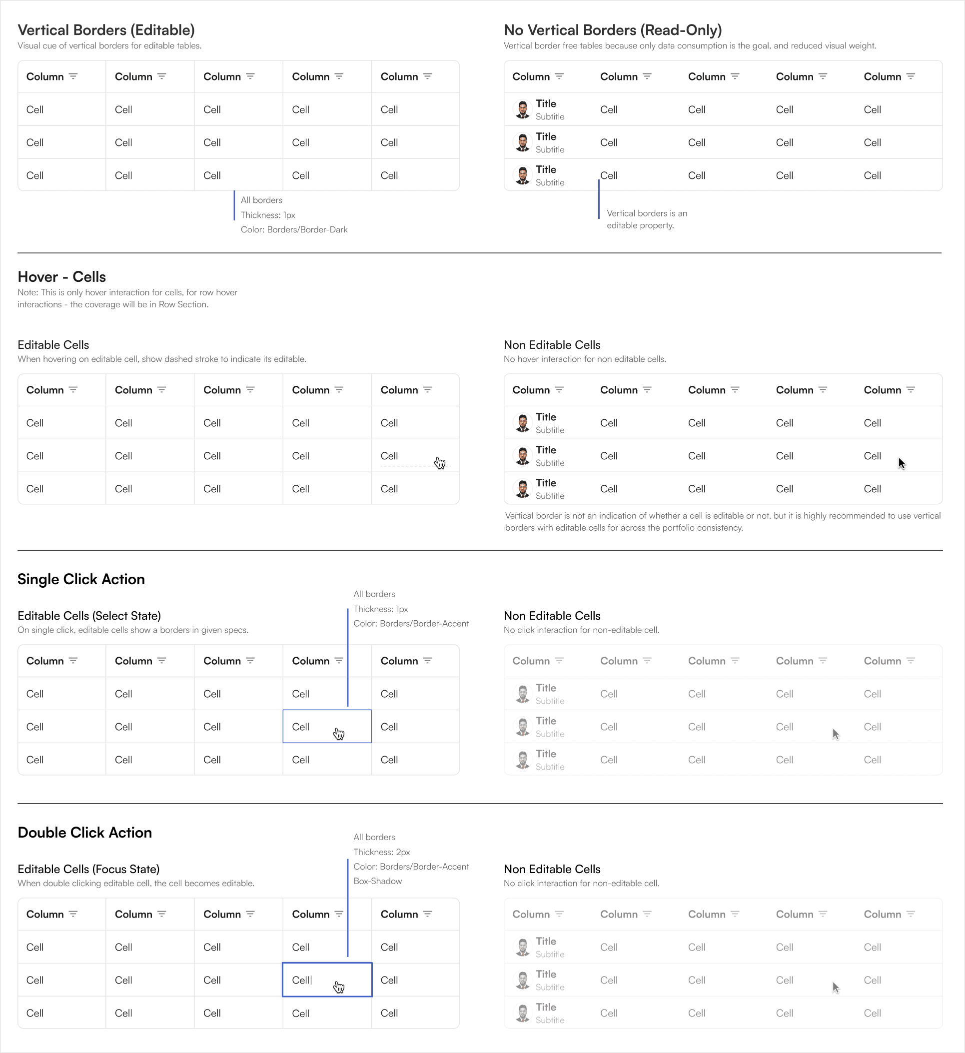
This is the most common table type on the web. It simply displays data for viewing. Items can be filtered and sorted, among other actions, but data cannot be altered directly. In BEAT portfolios, read only tables are visually distinguished by the lack of vertical borders between cells.
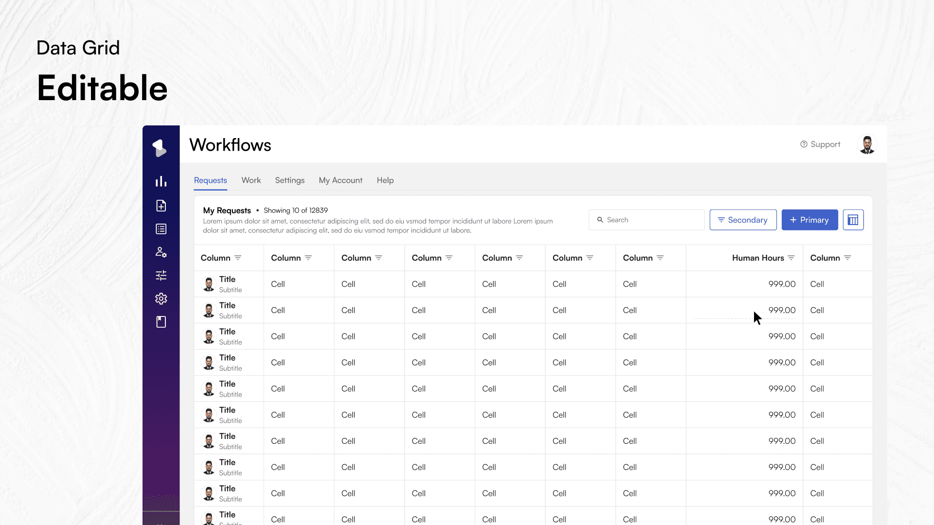
Editable
These grids, mostly used by analysts/admins who edit items for data entry, editing, and deletion. They are visually differentiated from the read-only grid by the presence of vertical borders around every cell. Additionally, an editable cell is further indicated by dotted line inside of a cell as shown in the image below.
Editable Grid
Cell interactions
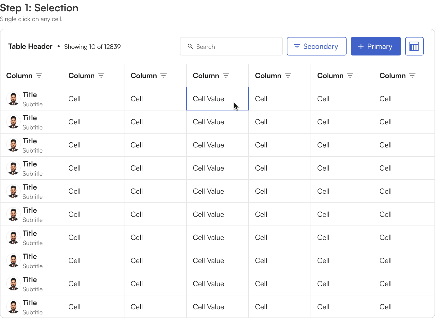
Cells can be in a number of different states. This is needed to support the different types of edit interactions both through mouse and keyboard navigation.
Cell states and keyboard navigation
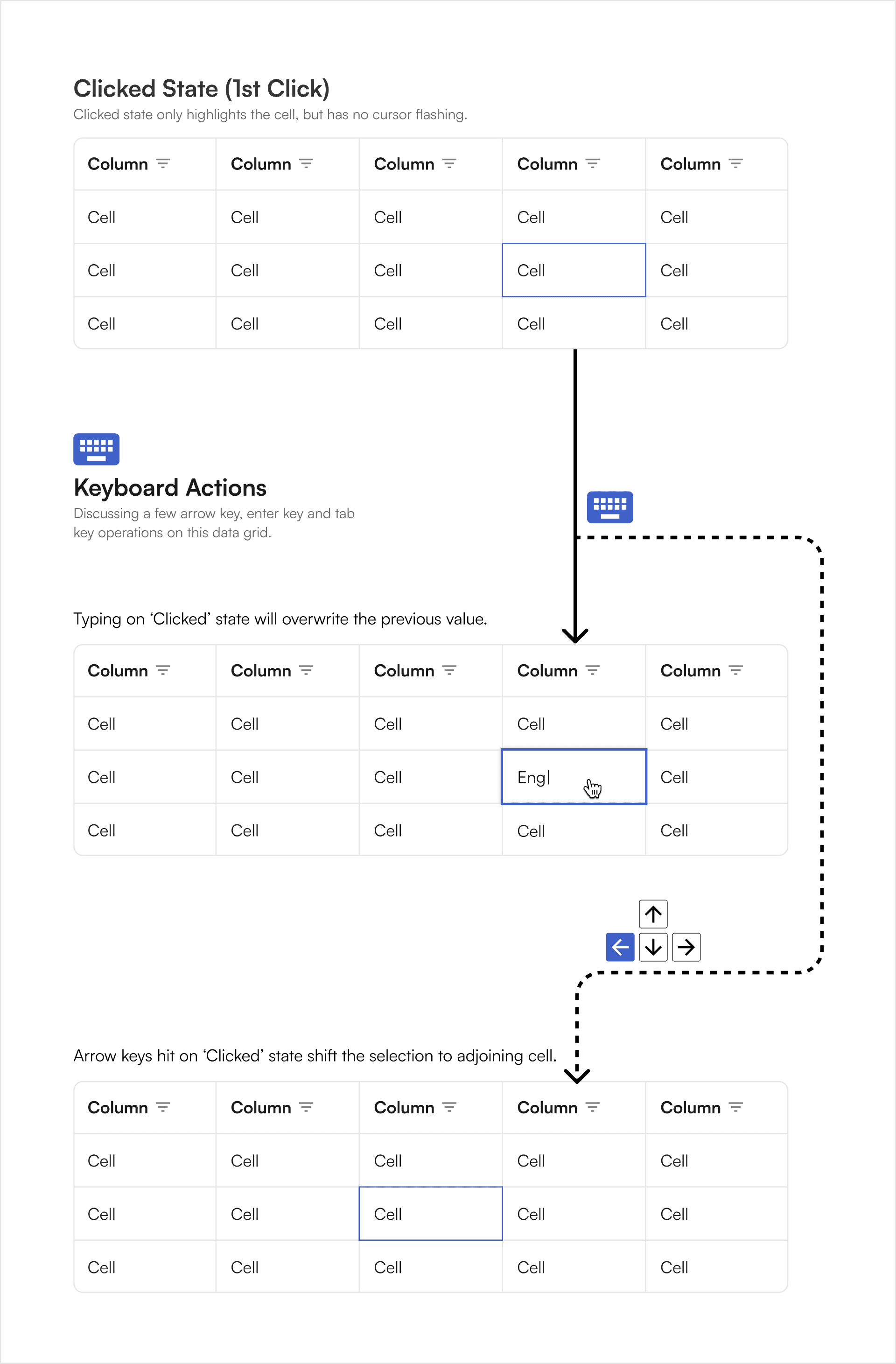
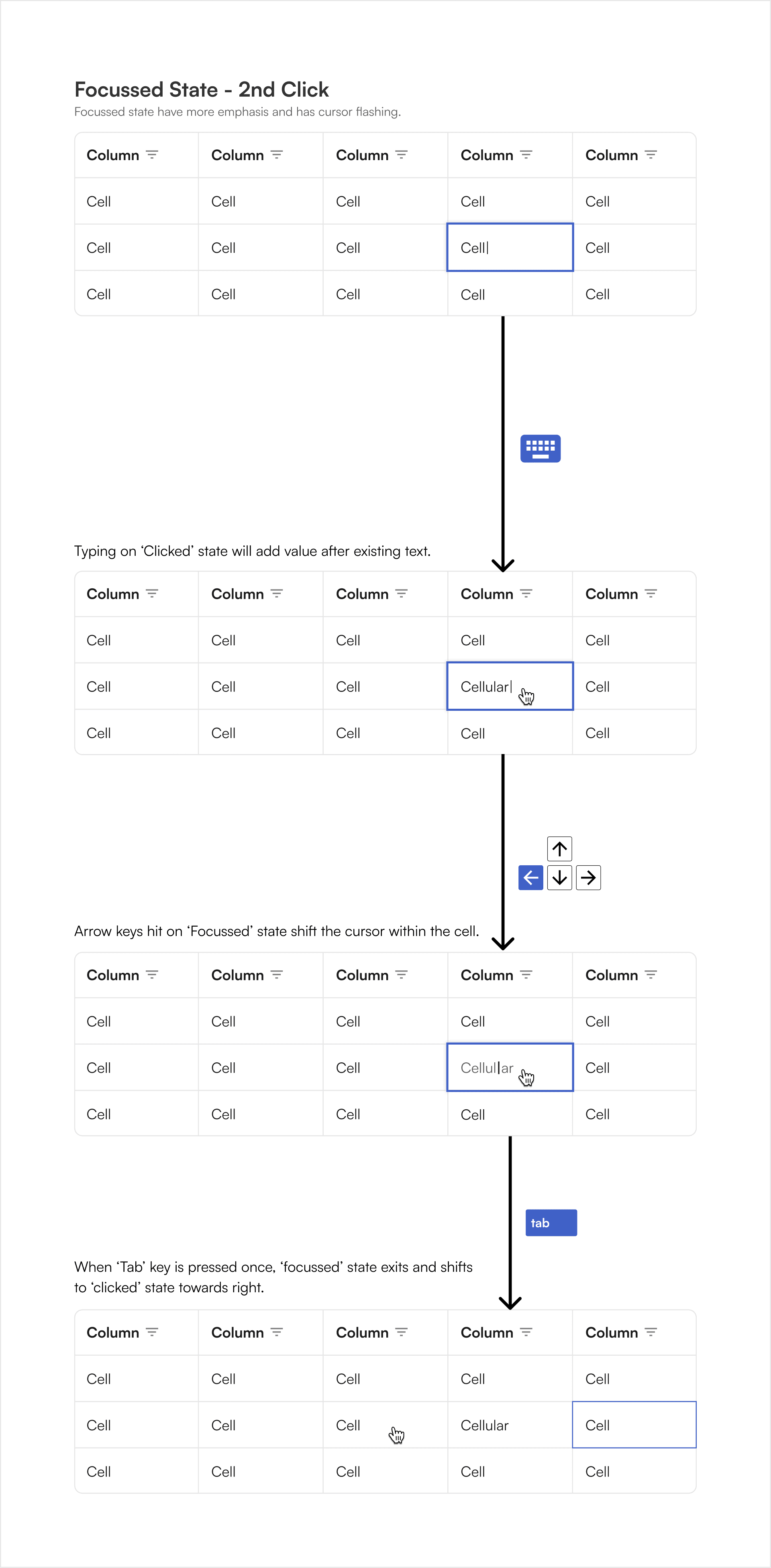
Single-Clicking on an editable cell will put it into a selected state, highlighting the cell, and any data entry will overwrite the contents of that cell.
In this state arrow keys will navigate from cell to cell and the tab key will advance from left to right.
Cell states at a glance (with mouse only)
Clicked State & further states
Focus State
Double-clicking on an editable cell will put it into a focus state, highlighting the cell and any entry will append the existing text contents of that cell.
However, as listed in the BEAT's UI kit grid section, many other data types or specially formatted text can be contained in the cell, including drop downs, phone numbers, currencies, and date pickers.
In this state arrow keys will navigate within the cell text data or within the options for that cell, for example, through the options of a dropdown.
The tab key will advance out of the focused cell to the next editable cell.
Special cells
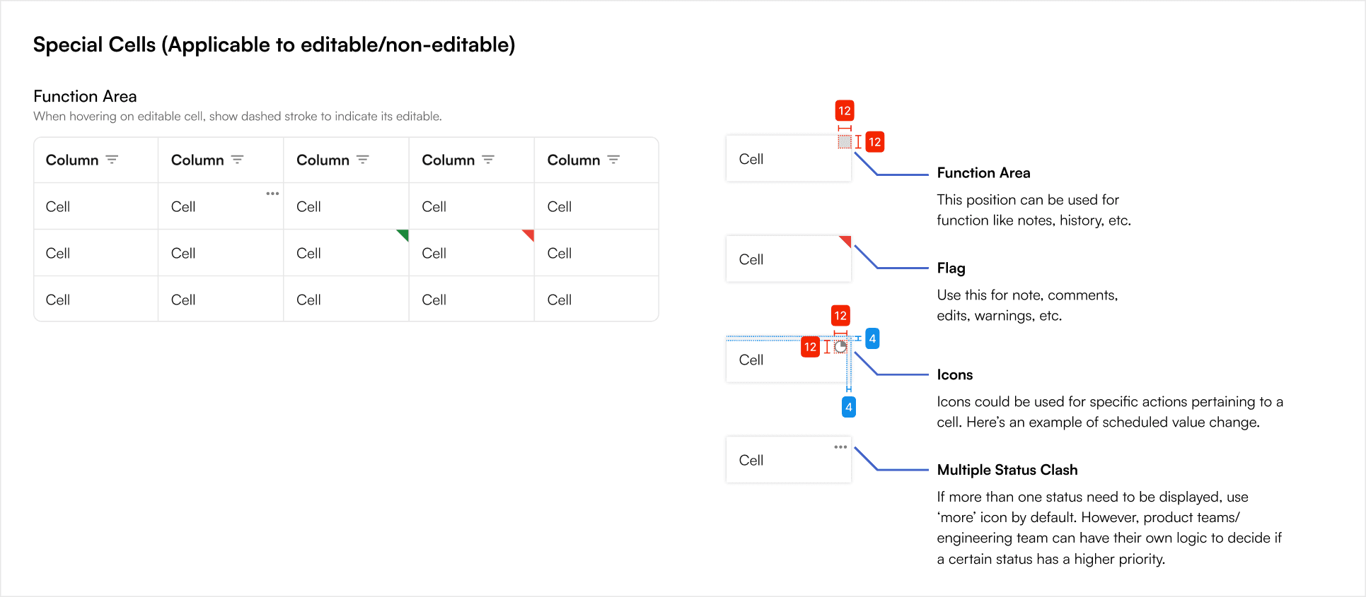
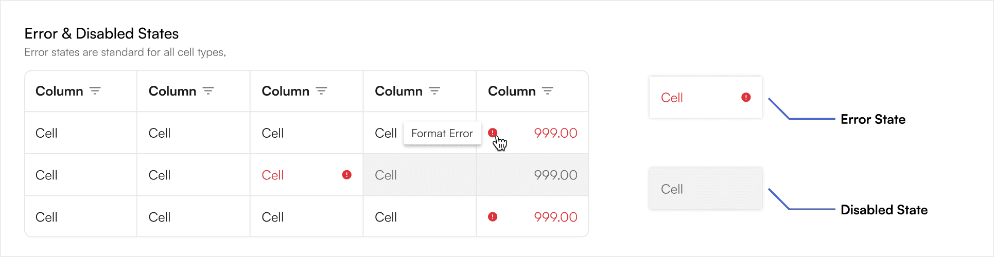
Disabled & Error Cells
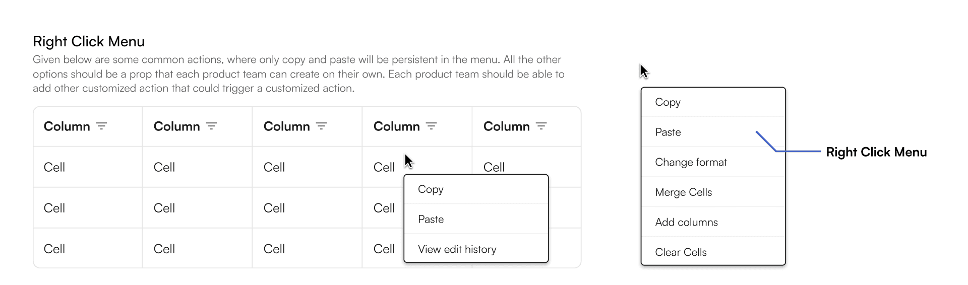
Right-Click sub menu
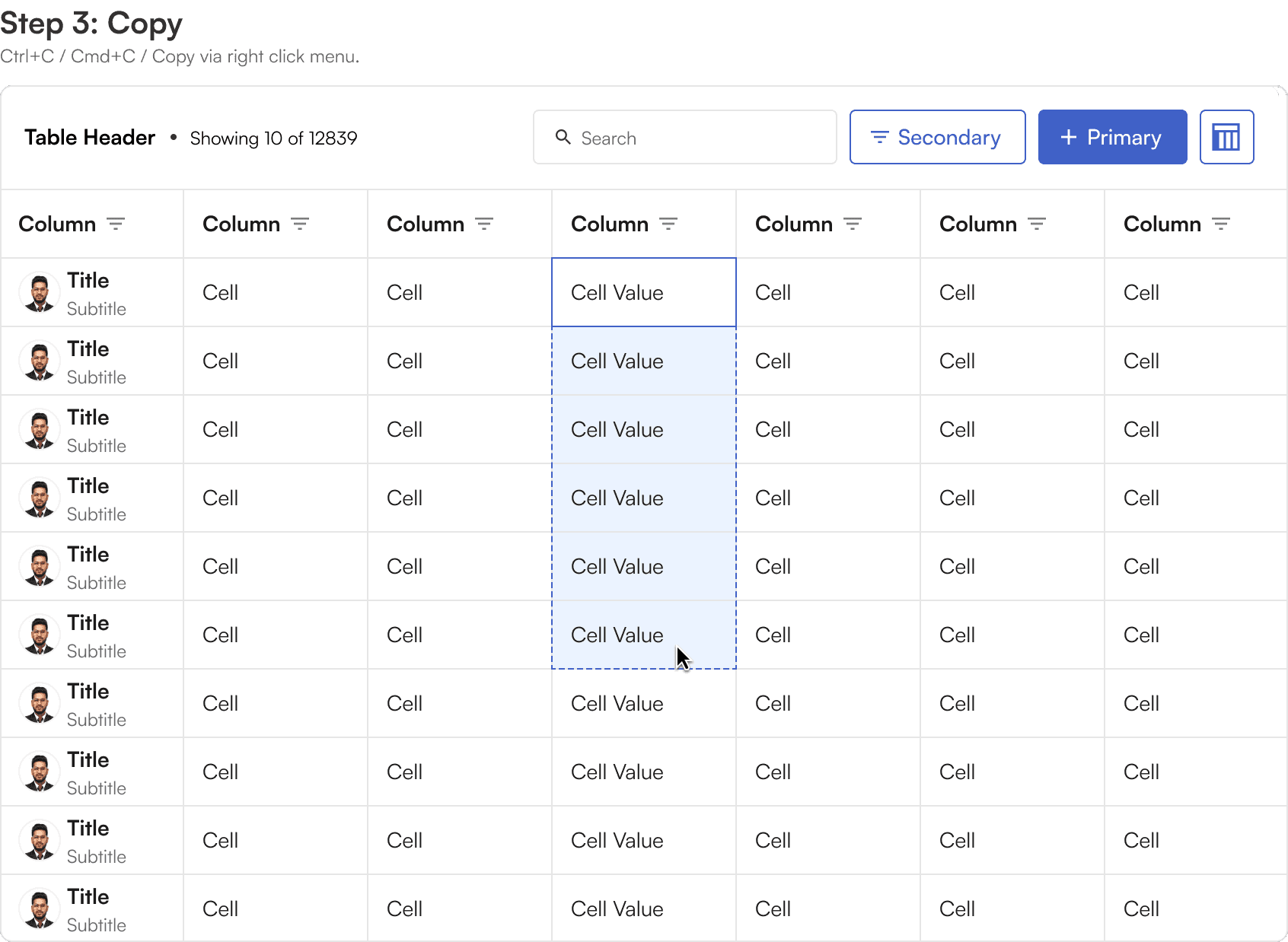
Right-clicking on a cell, at minimum, reveal a dropdown with options to copy, cut and paste.
Depending on the data type there may be additional options in this list.
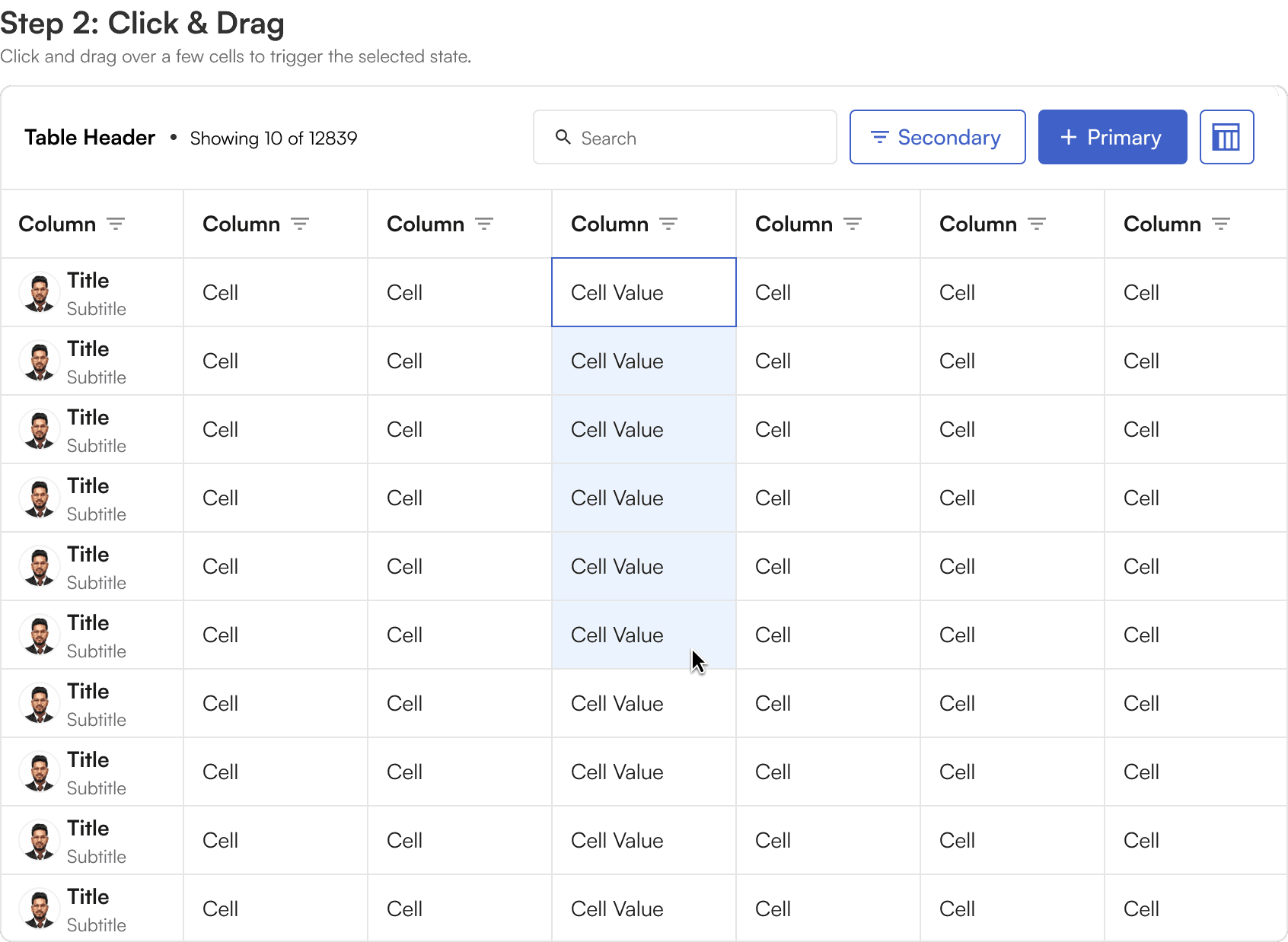
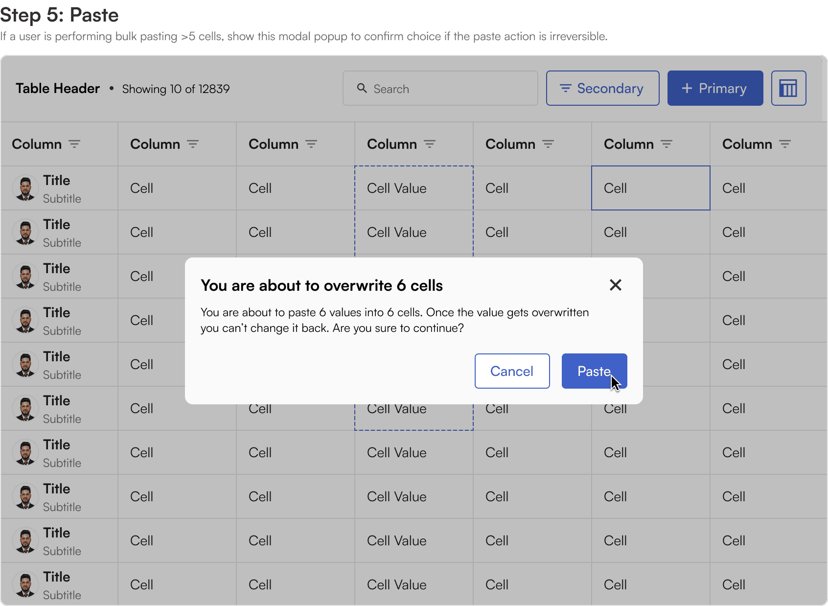
Bulk selection
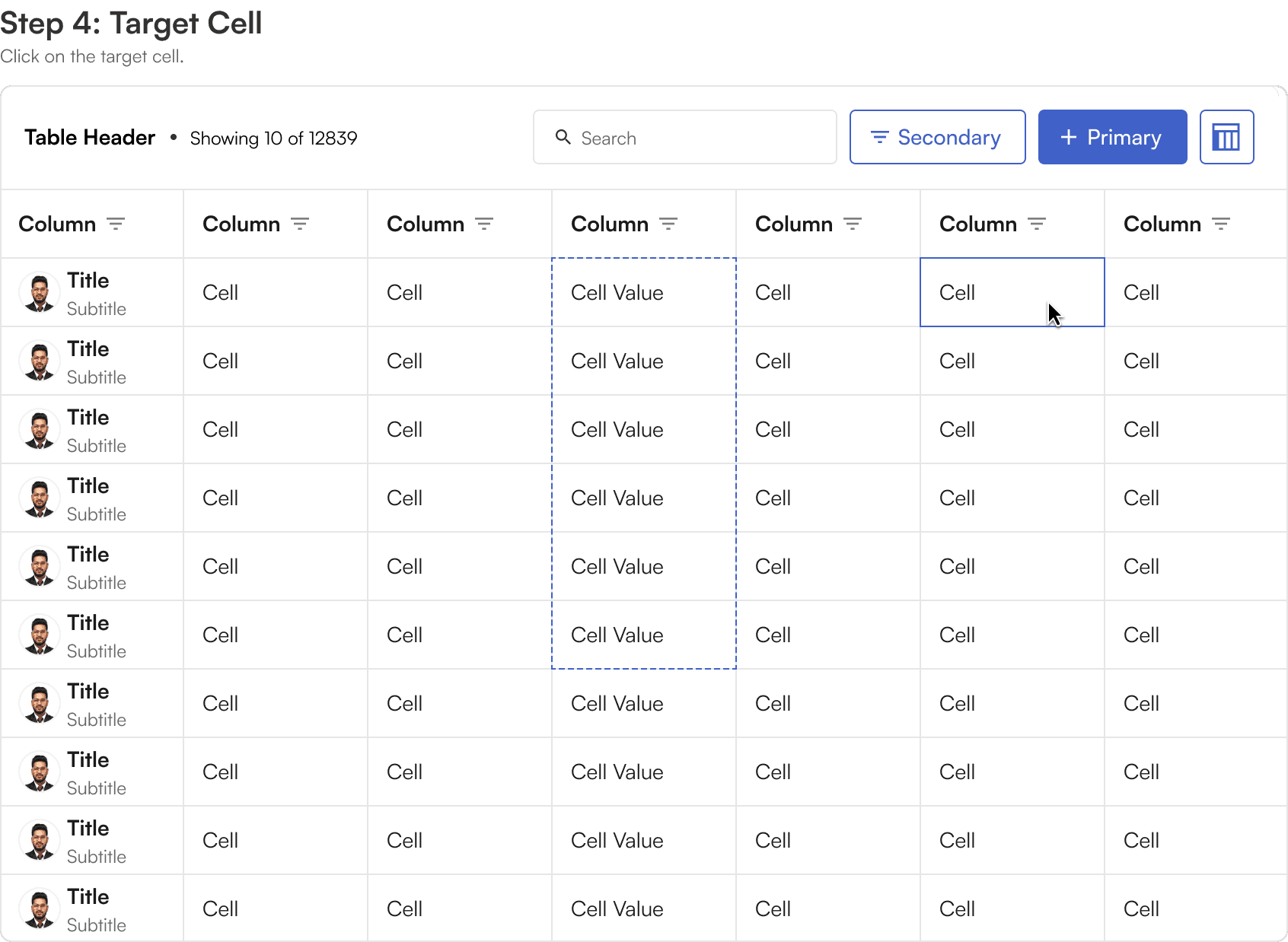
Click, hold and drag any directions allows for the selection of multiple cells at once.
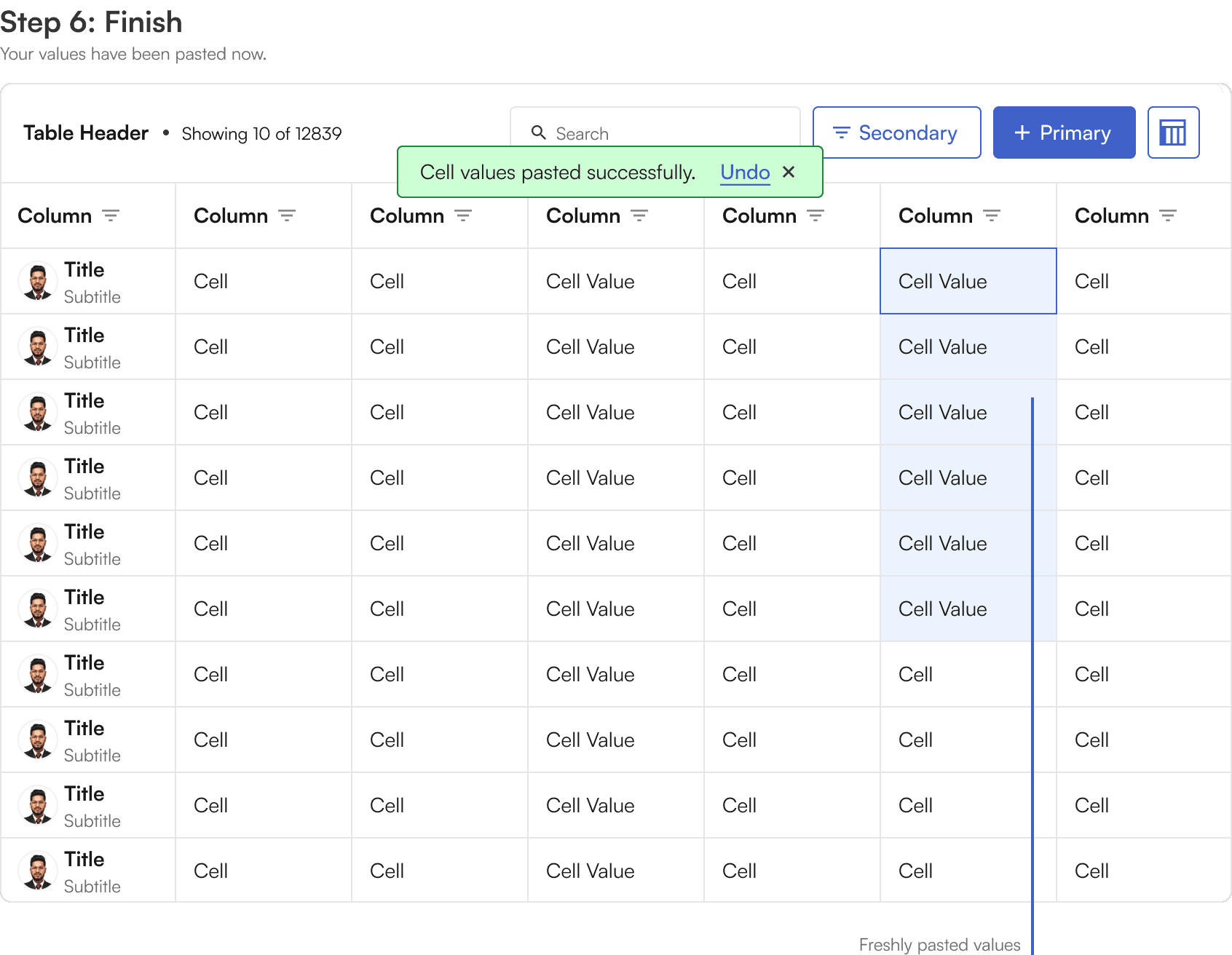
The data from the copied cells can be pasted into another cell, replacing the data with the same number of cells.
Pasting only works if the source data and destination data are of same data type. For example, we cannot bulk copy a list of numbers and place them on the date cells.
Disabled cells
Cells within editable grids can also be disabled, preventing any editing to certain cells.
This can be used block the editing of important data that should only be changed by certain administrators, or historic data that shouldn't be changed at all.
Row interaction
Multi-Row Selection
When the row index feature is enabled on the grid the user can select multiple rows individually or select all rows at once.
Any available bulk actions will appear above the grid.
Column interaction
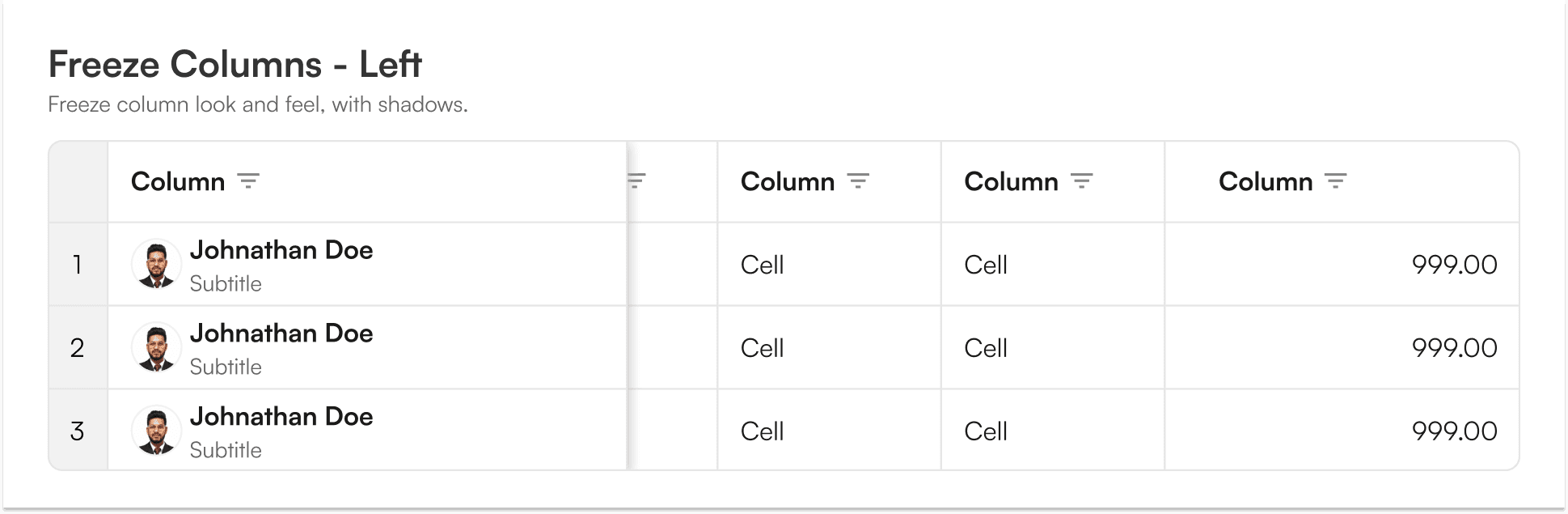
Column Freeze
The first column of a grid can be frozen, that is, locked in place so that the table data scrolls to the left underneath it.
Currently, we can freeze all the columns except the last column via the right click menu.
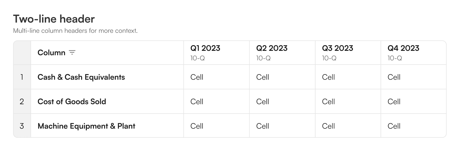
Two line headers
Individual column headers can support two-line text for more context.
This subtitle as a property is very effective for communicating two data points in one cell.
Column Filters & Controllers
Columns with filter will show a dropdown with options that are appropriate for the data type of the that column.
These commonly include sorting, filtering and renaming.
Filter aren't supported on columns if the column contains anchors or icons.
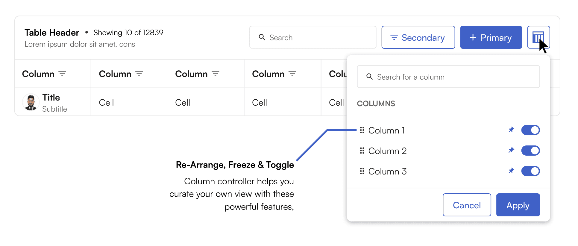
Column controller
Column controllers allow curating your own view of the table by re-arranging, freezing and toggling the columns. The column controller is a toggle prop and can be decided by product teams whether to have it or skip it.
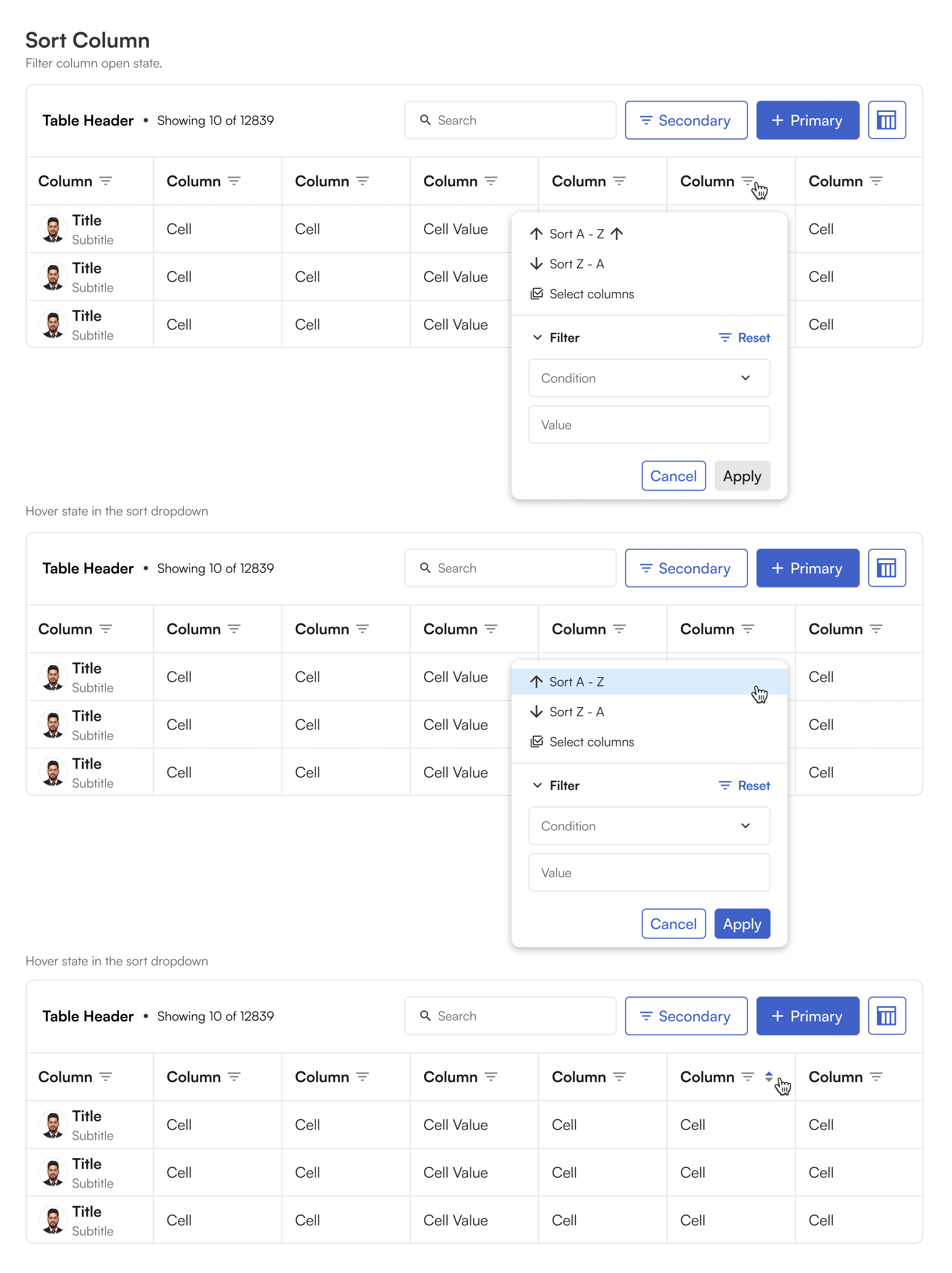
An example column filter dropdown
Filter dropdown allow quick access to sort like features at the same time, filtering columns based on preset conditions. The column filter dropdown changes with data type it is being opened at.
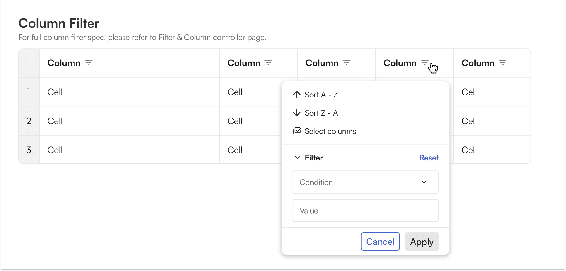
Column filter applied
Caveats
Why can't our table expand and collapse? Due to the technology we use, called "Virtualization", calculations of the height of rows must be consistent and for the foreseeable future expanding and collapsing will not be supported.
Why can't our table wrap the content inside? For the same reason we are not able to expand and collapse tables, the height of each row must be consistent. For this reason text that is too long to fit inside a cell will be truncated. However, users are able to hover the cell to read the full text with a tool tip.
How to display truncated data in larger columns? Truncated data can be shown either through tooltips OR sidepane. This ensures data visibility while editing/viewing longer strings in a restricted table.
What data can I put inside a cell? Grid cells support a wide variety of content types, including dates, phone numbers, avatars, drop downs, percentage, currency, with most supporting editing. A complete list of supported types with examples is available in BEAT Design System, Grid section.
Can I use icons? Short answer is yes. But because icons add additional data to the tables performance issues can arise, especially in long tables. For this reason they should be used as less as possible.